Nano Banana Pro: How to Make Art, Not Slop
We have the most advanced AI models in history, yet human beings choose to make and share “Shrimp Jesus?”
Oh, God! Why?
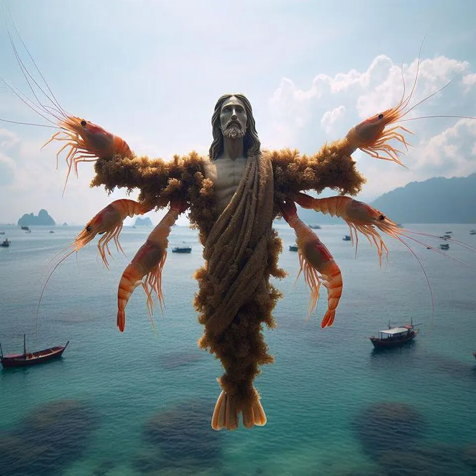
“Shrimp Jesus” an example of AI slop on Facebook
Google’s Nano Banana is the most impressive image model yet, but it doesn’t protect us from this onslaught of AI Slop. So, how do you harness this power to create high-quality art, instead of just high-resolution clickbait?
What is AI slop?
“AI Slop” is low-effort, mass-produced AI content that feels like filler rather than something made with intent. It feels cheap. It lacks soul. There may be extra fingers and rendering issues.
The Anatomy of Slop
Here’s Nano Banana’s attempt at “Facebook Engagement Bait” slop:
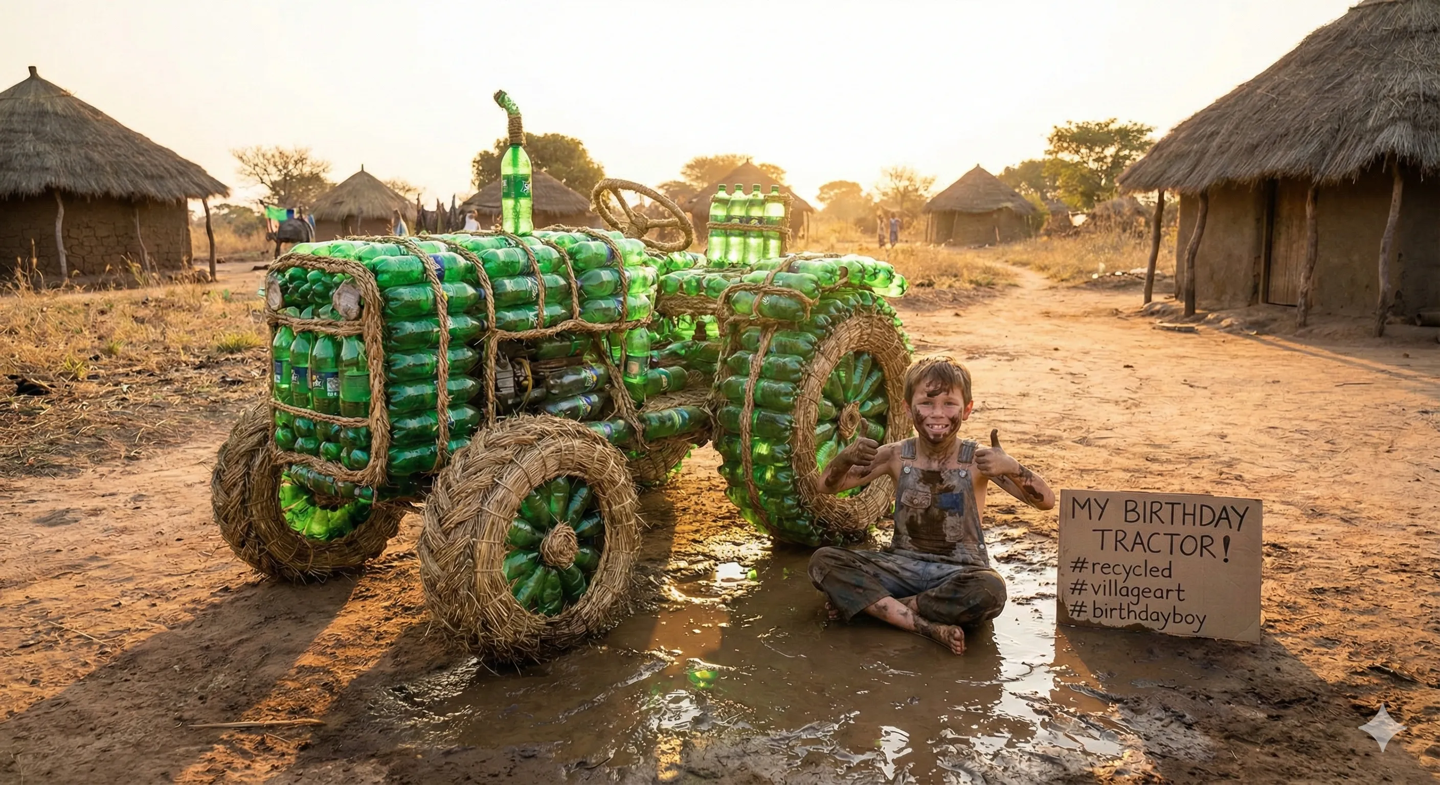
It’s slop because it’s fake. It is an attempt at low-effort manipulation. It tricks people into likes.
Why Does Slop Happen?
The main reason for the AI slop plague is that creating images is really easy now with these tools. Before you had to commission a talented artist (hundreds of dollars minimum). Combine cheap on-demand content with hungry social media algorithms, and it’s easy to see why slop is so commonplace.
How to Escape It: The Sampler Workflow
AI generation tools can and should be used to assist in the creative process. The main thing is to care. If the output is actually art, the artist will put in the work and that gives it soul. Previously, an idea had to be good (or at least believed to be good) because an artist had to put in the time and effort to implement the idea in reality. Now, we’ve lost that filter.
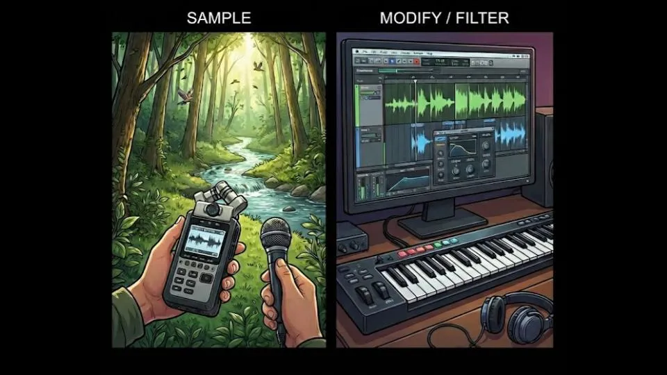
One approach to making good work with generative AI is the sampler workflow! I’m referring to sampling from electronic music production. Producers sample the environment (or often other tracks) to steal the energy or add uniqueness—I’m referring more to the sampling on “Alberto Balsalm” by Aphex Twin than Daft Punk’s splicing of disco records. Aphex Twin uses unconventional percussion sampled from household objects like chairs and metal boxes. There is a problem of uniqueness in music production today because everyone is using internet samples. So uniqueness comes from sampling outside the internet. Brining something new into the art.
We can apply sampling to image generation. The model is trained on internet content, so uniqueness increases dramatically when you input something from outside its bubble. Treating AI as purely a generator produces average results. Treating it as a filter to transform something external produces something new. If you sample from outside the internet, the AI is an amplifier and effects pedal that helps finish work.
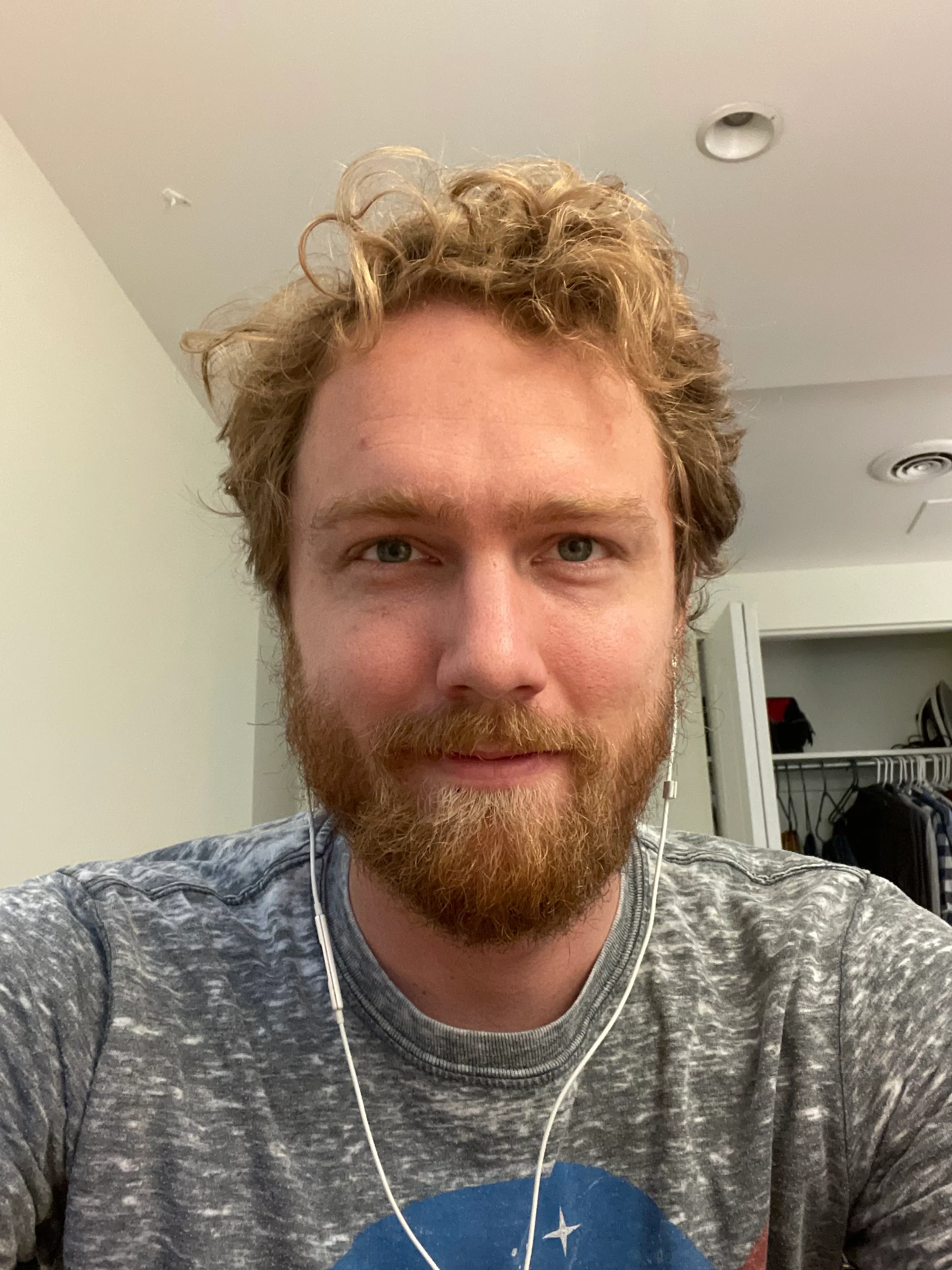
Case Study 1: The Profile Pic
I needed a new profile picture but didn’t want the standard AI avatar look.
Input image
First attempt:
Prompt:
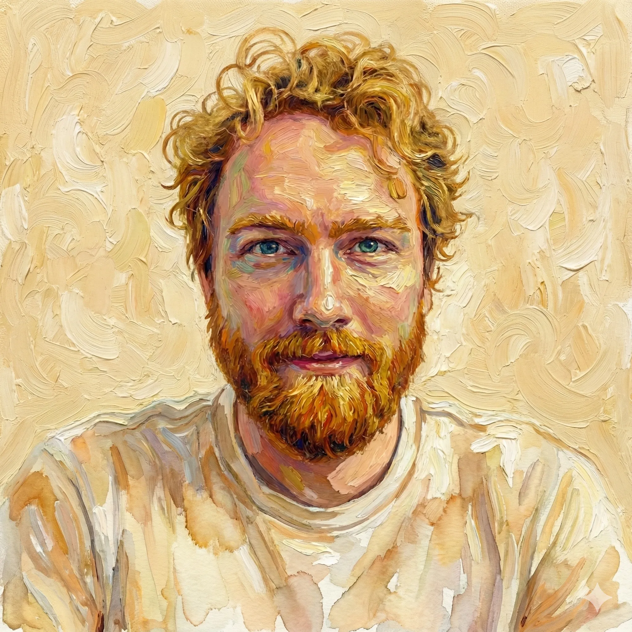
My blog is about: A creator’s journal—lessons from building products, making art, and betting on yourself. Turn this picture into an artistic image I can use as a profile picture on my blog. The background should be 1 solid color. The style and color should be impressionistic like Van Gogh.
I actually like this result, but I kept going anyway because why not?
Iterations:
Prompt:
I want 2 alternative versions. Art nouveau and Pop art (Warhol-style).
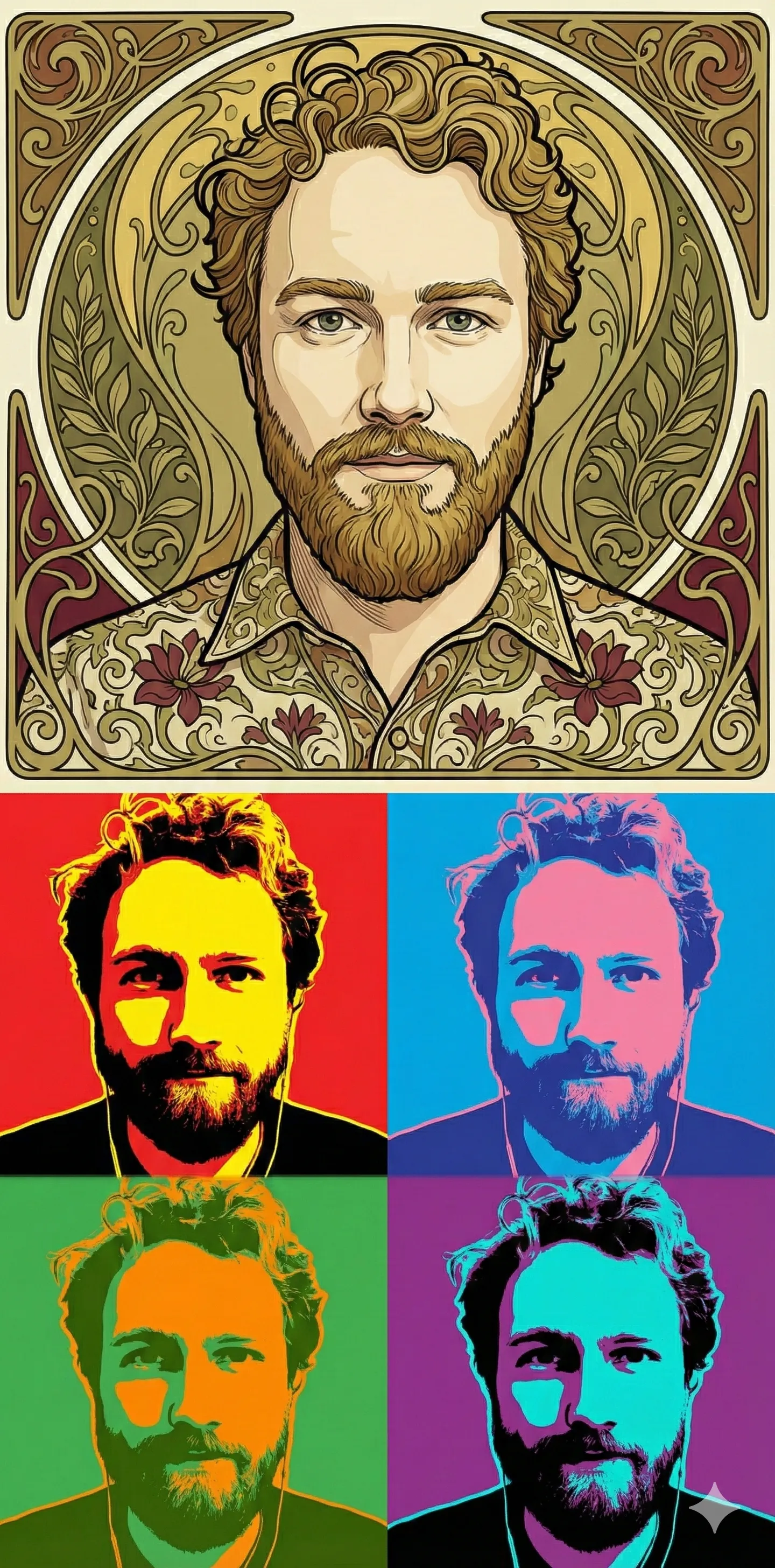
Neither of these were appealing. They looked like slop.
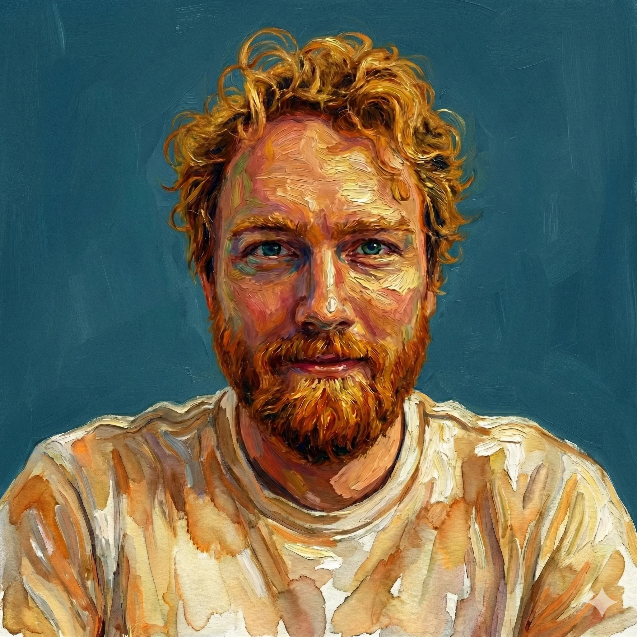
Prompt:
For pop art—just 1 image, not 4 (that is cliche now). Mix pop art style with impressionist style (1 image, not 4).
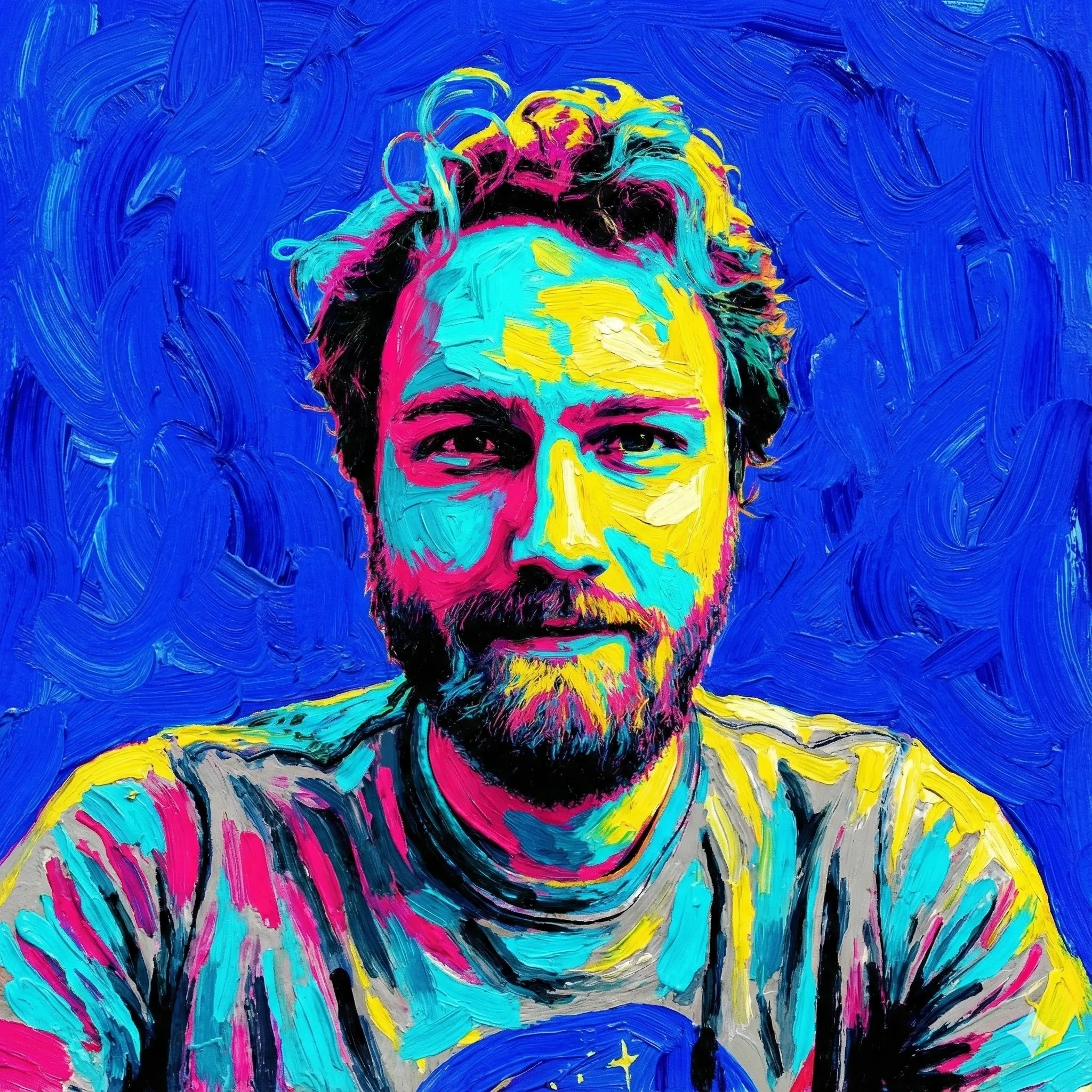
This one was very loud. It hurt my eyes.
Prompt:
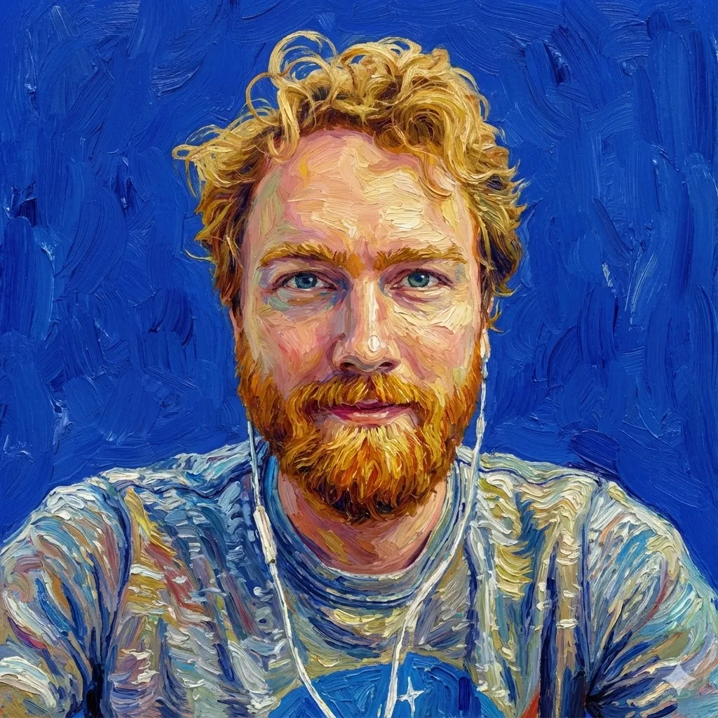
The colors are too intense… try again with impressionist Van Gogh meets Studio Ghibli.
The Studio Ghibli fusion worked better, but I had to do something about the creatures in my hair. The model mixed watercolor (my shirt) and the thick impressionistic paint textures.
From there I refined:
Prompt:
Very good! I like this one, but the background should be more of a solid color rather than a landscape (think profile picture). Remove the creatures from the hair.
This one was all warm yellowish. It looked fine, but also more like wall texture.
Prompt:
Good, but now the foreground and the background are blended too much. There should be more contrast. Add contrast so the foreground portrait stands out and doesn’t blend in.
Still not what i was looking for. It made my face look aged somehow with the strokes and the background was washed out grey blue. I’m a sucker for blue, so I added that into the prompt.
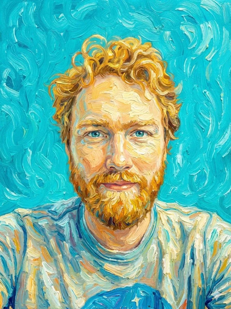
Prompt:
Now the image looks sad. We want a bright background color (think energetic blue or teal). We want to keep the impressionistic vibes through the entire image. The foreground image looks darker… it should be brighter (closer to your first attempt at Studio Ghibli meets impressionist Van Gogh).
Prompt:
This is good, but maybe a deeper blue in the background… I love it but let’s try a bit more contrast.
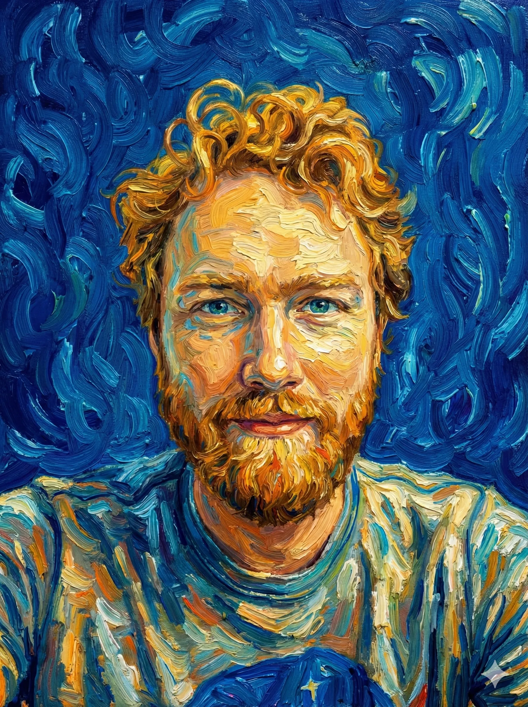
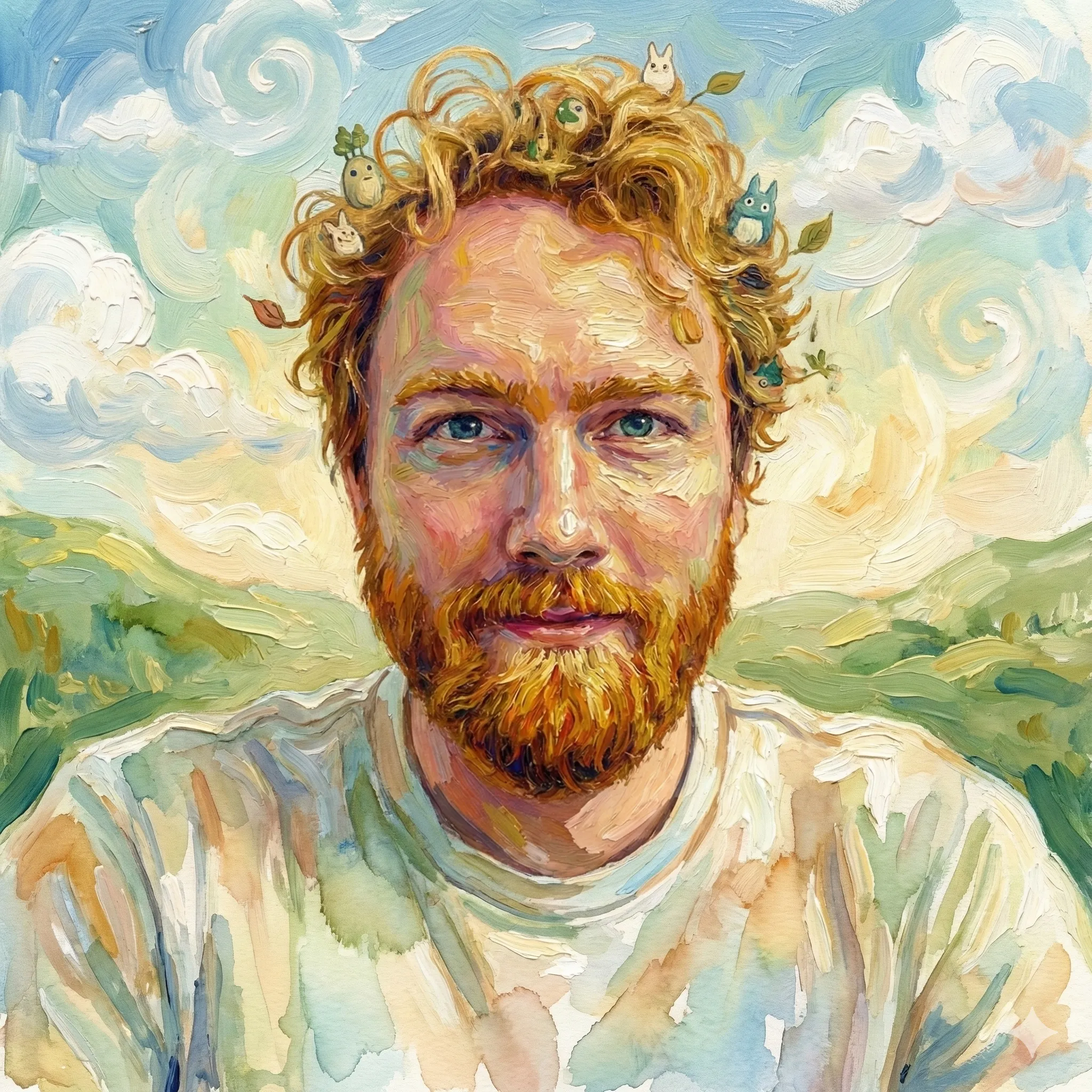
Final selection
My hair never looks this good. I don’t have the skills to create this without Nano Banana. The model is still coarse and difficult to steer in fine detail, but we took a step to a new place each time.
Case Study 2: The Colorized Cartoon
For a creative outlet while building my text-to-speech app, Reazy, I drew some Gary Larson-inspired single-panel cartoons for a creative outlet. I wanted to finish them, but I didn’t feel like i had the time or willpower to color them myself, and I didn’t want to release them without color. Color adds so much! The fun for me was in the challenge of drawing the idea.
A few months ago, I searched for a product that could color line drawings with AI. There was nothing good on the market. Now Nano Banana Pro handles this use case beautifully.
You know, guys, it’s really hard to make a single panel cartoon funny. That’s what I learned from making these.
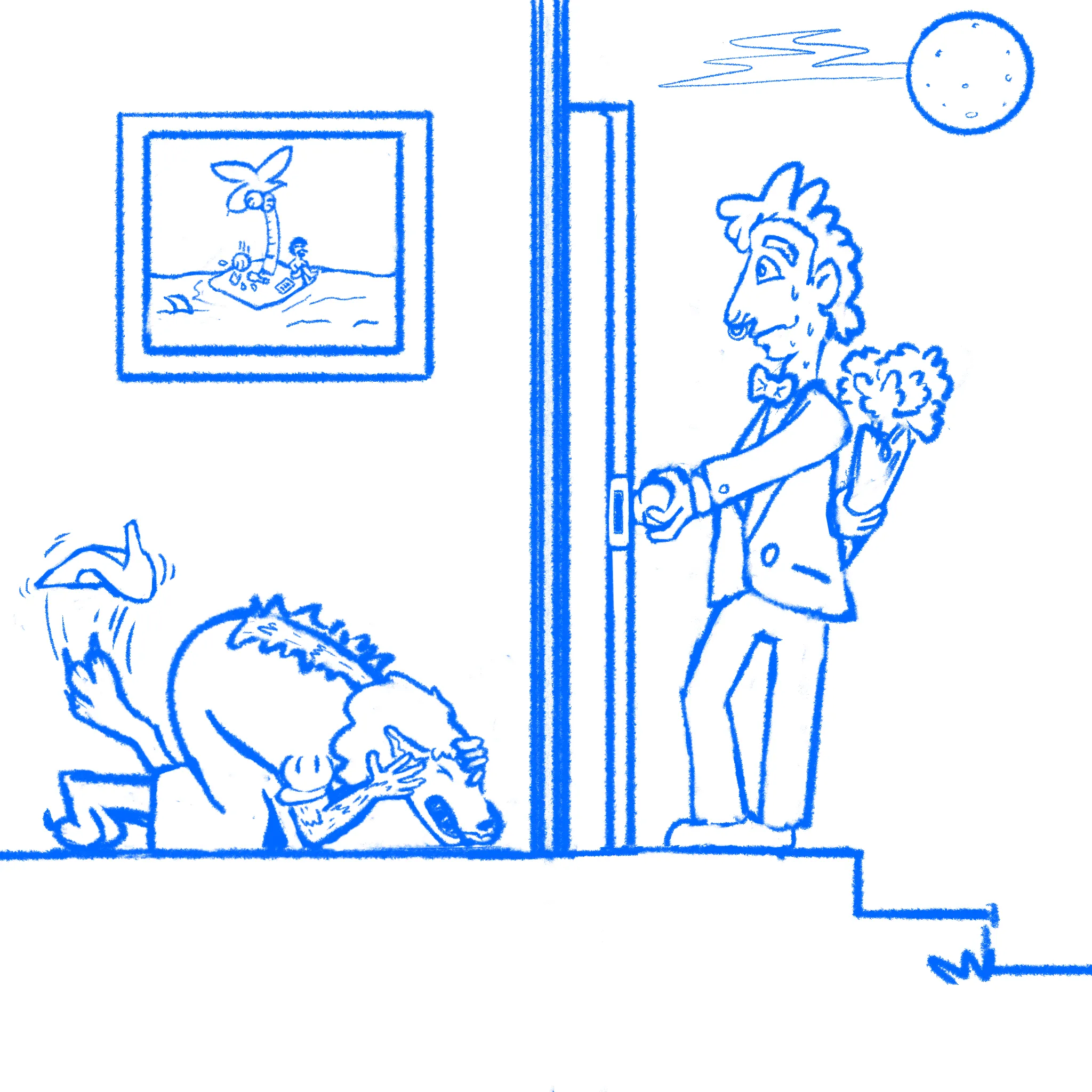
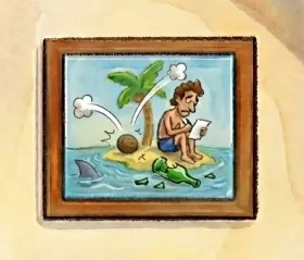
Input image
Caption:
Her dating profile said “must love dogs.” Mike thought nothing of it.
First attempt: My prompt was too simple:
Prompt:
Color and improve this cartoon.
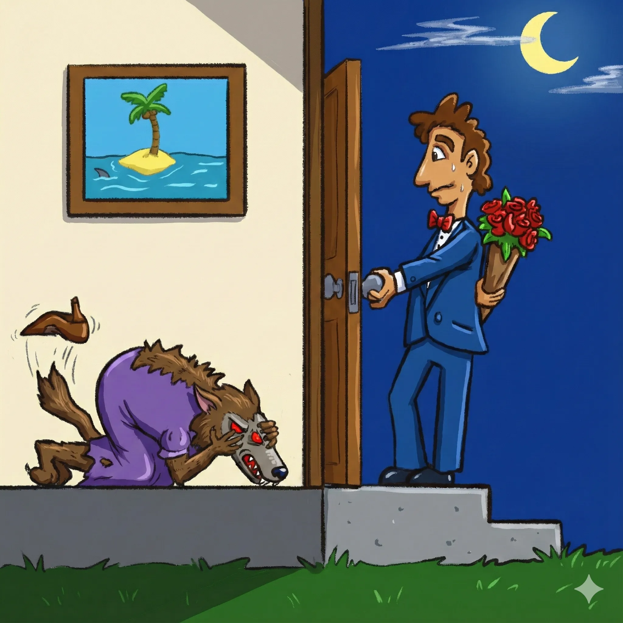
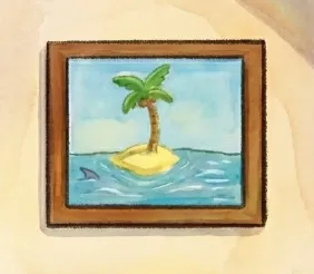
The result had flat colors, no texture, and the model changed details I wanted preserved (the full moon became a crescent, the wolf has an extra eye, the image on the wall was an easter egg to The Far side and it erased the guy stuck on the island!).
The fine detail problem: This is the biggest problem with using Nano Banana. Steering it can feel higher level than you actually want. In this image, there’s a cartoon within the cartoon—an easter egg on the wall showing a man stranded on an island writing a message in a bottle that is smashed by a falling coconut. The model kept bungling this.
First it wiped the man from the island entirely.
Prompt:
In the image on the wall, there should be a guy stranded writing a note on paper on the island and a coconut has just fallen and shattered his bottle.
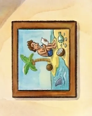
Prompt:
Great! But now the smashed bottle is missing in the image. It should be added back. The coconut also needs whoosh lines above it (like it fell from the tree).
Prompt:
Ok, the whoosh you made is too much, remove them. The smashed bottle in the image should be under the coconut (currently you made it to the right). Coconut falls from tree and smashes bottle is the story in the image within the image. The coconut just needs some impact lines or some way in the art to show it fell from the tree (less is more—impact lines are minimalistic).
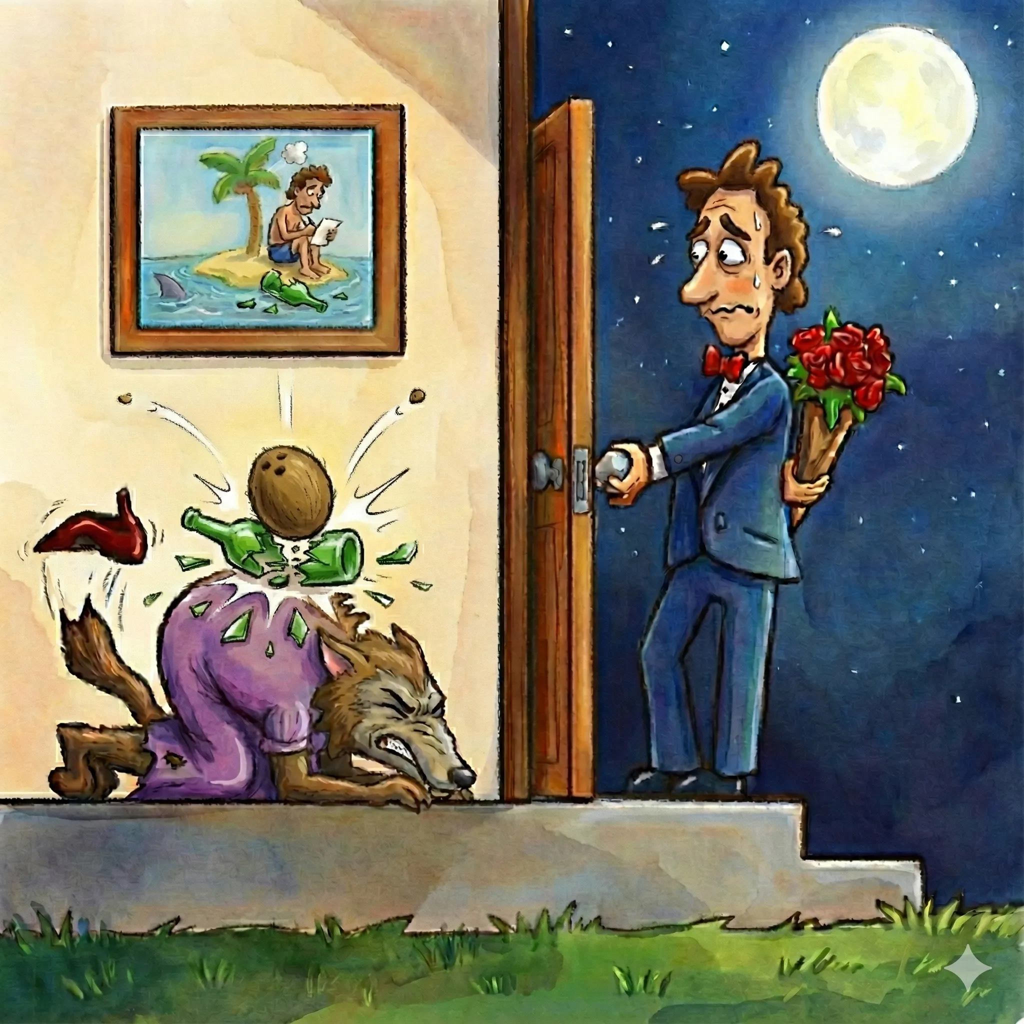
As you can see, the model had trouble understanding editing smaller details in a specific part of the image. In this version, there are two smashed bottles. Each correction created new issues. As good as Nano Banana is, translating English descriptions into precise rendering edits is still difficult for image models.
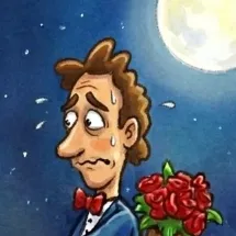
However, Nano Banana handled facial expressions well. For the man’s nervous look:
Prompt:
The man’s face isn’t the best. He is nervous. Let’s improve his eyes, eyebrow placement, and the nervous mouth. We can also give him a bit more of a forehead. Improve the aesthetic of his face, but he should remain nervous.
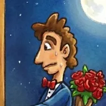
Final image:
Prompt:
In the image on the wall, we need the coconut to have just smashed a bottle (currently there is no smashed bottle underneath the coconut. The smashed bottle is on the island, underneath the coconut. Minimal smash lines from the impact are also helpful).
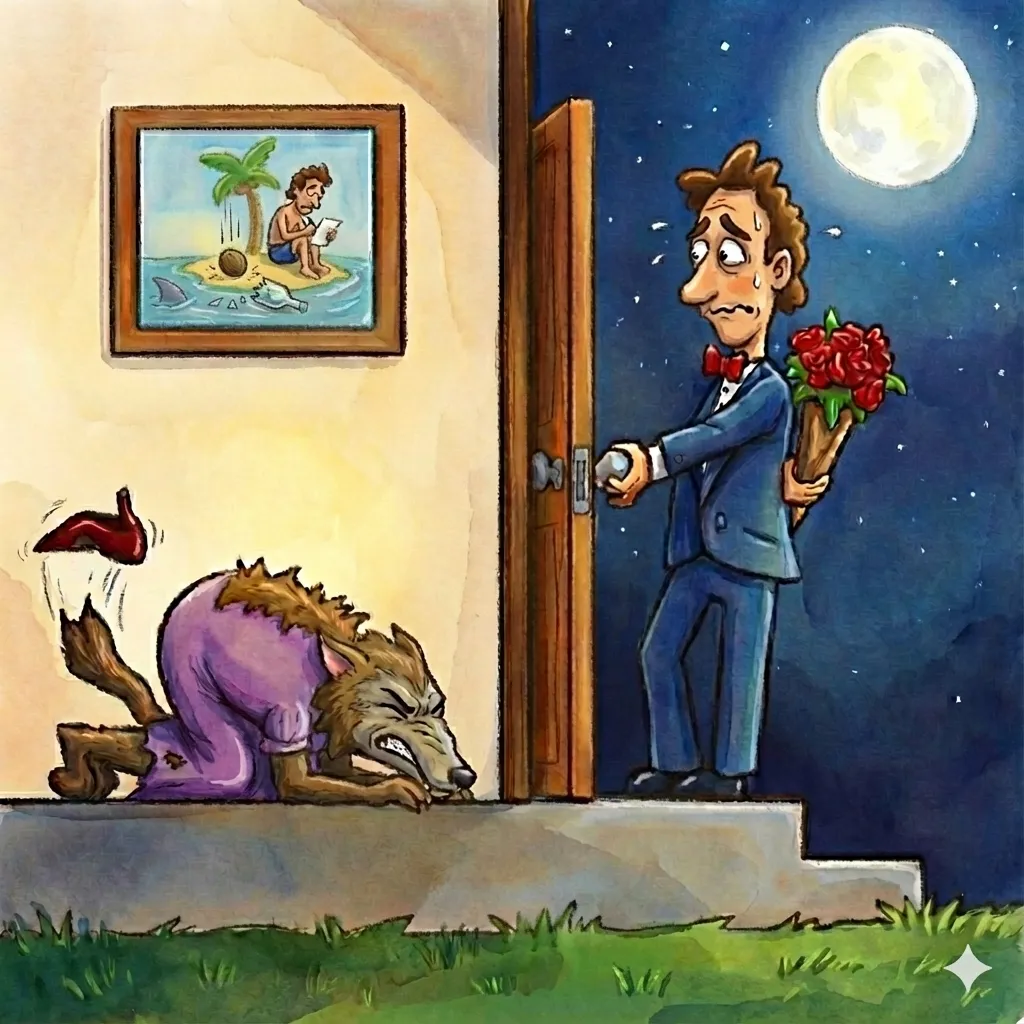
Final selection
Case Study 3: The Burning Bush (Sketch to Paint)
This case study tested going from low-fidelity sketch to high-fidelity painting.
Input image
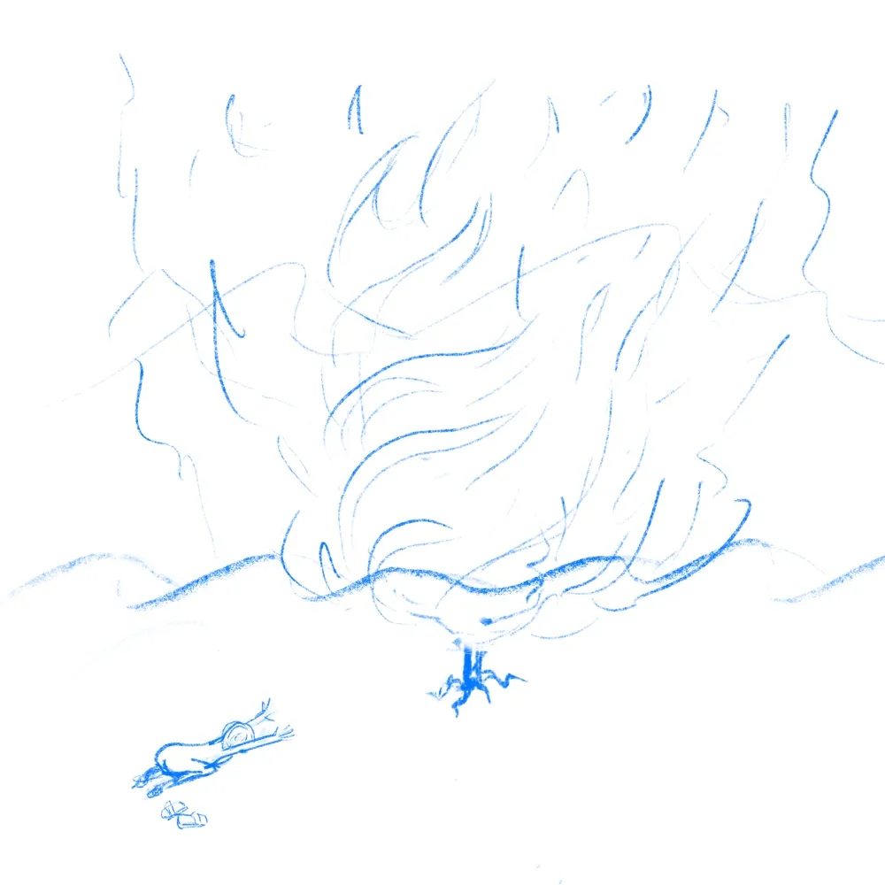
First attempt
Prompt:
I want you to finish and paint this image. It is I believe Moses in front of the burning bush. It should be night time with a Starry Sky and the fire should be glowing bright… stay true to the sketch but we want vivid colors.
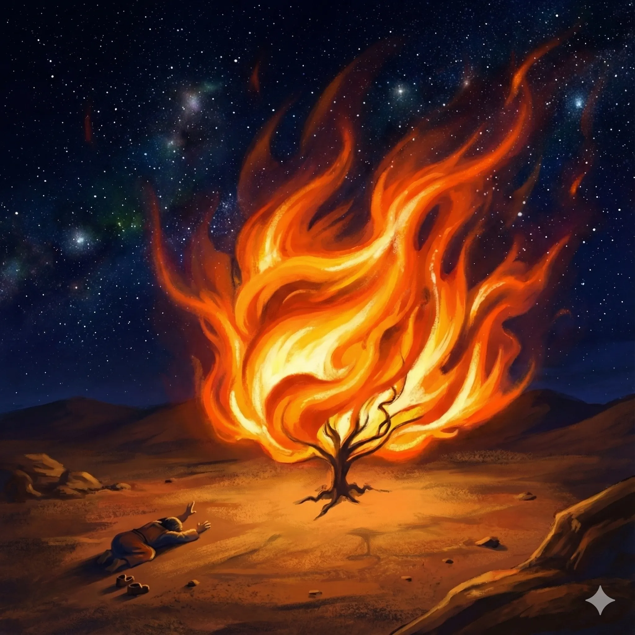
The first version was surprisingly good given how sparse my sketch was. It kept my root structure, added a beautiful starry sky, and made Moses more realistic while preserving the kneeling pose. The downside is that it lost some of the style of Moses with his booty in the air—regular human proportions. That’s boring. Sometimes the first generation is a potential keeper.
Refinements: I tried making the fire and sky more psychedelic, more impressionistic. None of it improved on the original. So I settled for enhancements:
Prompt:
The fire should be bigger to the big swirling fire to the point where you can’t really see much of the sky. It should be like a really bright terrifying fire.
This is great. But I want more contrast between the fire and everything else. Everything else should be darker except where the fire light is touching it.
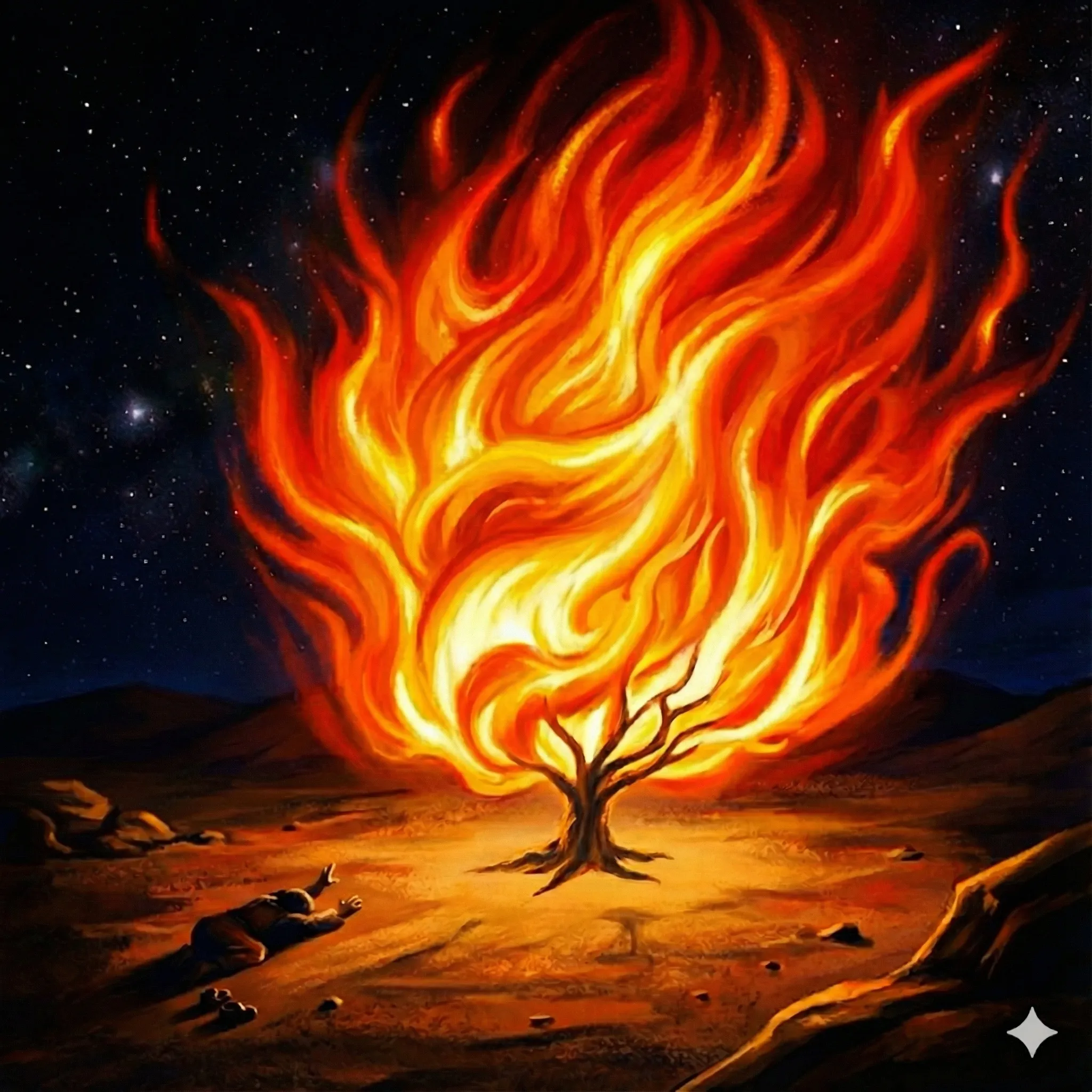
Final selection
Takeaway
Nano Banana Pro is the best image model I’ve used. AI image generation is moving past the uncanny valley and becoming a genuine creative collaborator. The sampling workflow is a winner! It’s really great that models are becoming more collaborative so they can amplify the creative ideas of the artist.
There are still limitations. Translating English into precise rendering details can be crude. Fine-tuning small parts of an image isn’t accurate. You may need to add post-processing in Photoshop or GIMP to move pixels exactly where you want them for the final polish.
To recap, here’s the full workflow:
- Start with an idea that matters
- Sample from the real world
- Iterate
- Post-process for polish
Happy prompting!